An Attempt at Quantifying Changes to Genre Medium, cont’d.

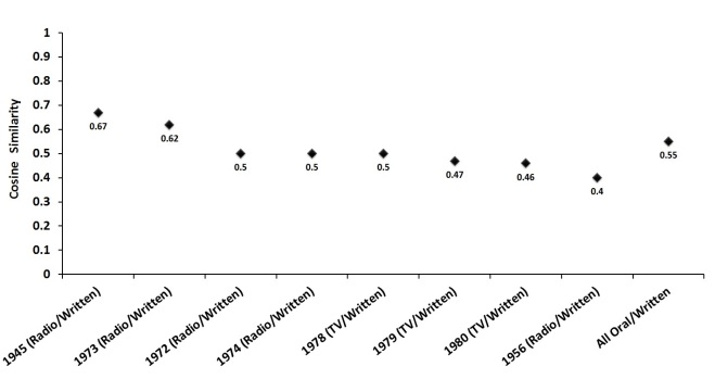
Cosine similarity of all written/oral States of the Union is 0.55. A highly ambiguous result, but one that suggests there are likely some differences overlooked by Rule et al. (2015). A change in medium should affect genre features, if only at the margins. The most obvious change is to length, which I pointed out in the last post.

But how to discover lexical differences? One method is naive Bayes classification. Although the method has been described for humanists in a dozen places at this point, I’ll throw my own description into the mix for posterity’s sake.

Naïve Bayes classification occurs in three steps. First, the researcher defines a number of features found in all texts within the corpus, typically a list of the most frequent words. Second, the researcher “shows” the classifier a limited number of texts from the corpus that are labeled according to text type (the training set). Finally, the researcher runs the classifier algorithm on a larger number of texts whose labels are hidden (the test set). Using feature information discovered in the training set, including information about the number of different text types, the classifier attempts to categorize the unknown texts. Another algorithm can then check the classifier’s accuracy rate and return a list of tokens—words, symbols, punctuation—that were most informative in helping the classifier categorize the unknown texts.

More intuitively, the method can be explained with the following example taken from Natural Language Processing with Python. Imagine we have a corpus containing sports texts, automotive texts, and murder mysteries. Figure 2 provides an abstract illustration of the procedure used by the naïve Bayes classifier to categorize the texts according to their features. Loper et al. explain:

BayesExample

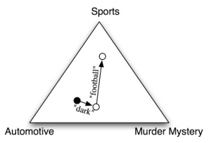
In the training corpus, most documents are automotive, so the classifier starts out at a point closer to the “automotive” label. But it then considers the effect of each feature. In this example, the input document contains the word “dark,” which is a weak indicator for murder mysteries, but it also contains the word “football,” which is a strong indicator for sports documents. After every feature has made its contribution, the classifier checks which label it is closest to, and assigns that label to the input.

Each feature influences the classifier; therefore, the number and type of features utilized are important considerations when training a classifier.

Given the SotU corpus’s word count—approximately 2 million words—I decided to use as features the 2,000 most frequent words in the corpus (the top 10%). I ran NLTK’s classifier ten times, randomly shuffling the corpus each time, so the classifier could utilize a new training and test set on each run. The classifier’s average accuracy rate for the ten runs was 86.9%.

After each test run, the classifier returned a list of most informative features, the majority of which were content words, such as ‘authority’ or ‘terrorism’.

However, a problem . . . a direct comparison of these words is not optimal given my goals. I could point out, for example, that ‘authority’ is twice as likely to occur in written than in oral States of the Union; I could also point out that the root ‘terror’ is found almost exclusively in the oral corpus. Nevertheless, these results are unusable for analyzing the effects of media on content. For historical reasons, categorizing the SotU into oral and written addresses is synonymous with coding the texts by century. The vast majority of written addresses were delivered in the nineteenth century; the majority of oral speeches were delivered in the twentieth and twenty-first centuries. Analyzing lexical differences thus runs the risk of uncovering, not variation between oral and written States of the Union (a function of media) but variation between nineteenth and twentieth century usage (a function of changing style preferences) or differences between political events in each century (a function of history). The word ‘authority’ has likely just gone out of style in political speechmaking; ‘terror’ is a function of twenty-first century foreign affairs. There is nothing about medium that influences the use or neglect of these terms. A lexical comparison of written and oral States of the Union must therefore be reduced to features least likely to have been influenced by historical exigency or shifting usage.

In the lists of informative features returned by the naïve Bayes classifier, pronouns and contraction emerged as two features fitting that requirement.

AllPronounsRelFreq

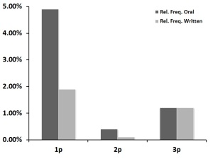
Relative frequencies of first, second, and third person pronouns

WeUsYouPronounsRelFreq

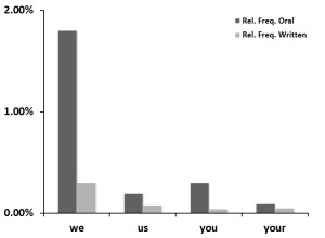
Relative frequencies of select first and second person pronouns

ContractionsRelFreq

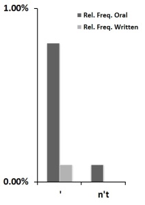
Relative frequencies of apostrophes and negative  contraction

It turns out that pronoun usage is a noticeable locus of difference between written and oral States of the Union. The figures above show relative frequencies of first, second, and third person pronouns in the two text categories (the tallies in the first graph contain all pronomial inflections, including reflexives).

As discovered by the naïve Bayes classifier, first and second person pronouns are much more likely to be found in oral speeches than in written addresses. The second graph above displays particularly disparate pronouns: ‘we’, ‘us’, ‘you’, and to a lesser extent, ‘your’. Third person pronouns, however, surface equally in both delivery mediums.

The third graph shows relative frequency rates of apostrophes in general and negative contractions in particular in the two SotU categories. Contraction is another mark of the oral medium. In contrast, written States of the Union display very little contraction; indeed, the relative frequency of negative contraction in the written SotU corpus is functionally zero (only 3 instances). This stark contrast is not a function of changing usage. Negative contraction is attested as far back as the sixteenth century and was well accepted during the nineteenth century; contraction generally is also well attested in nineteenth century texts (see this post at Language Log). However, both today and in the nineteenth century, prescriptive standards dictate that contractions are to be avoided in formal writing, a norm which Sairio (2010) has traced to Swift and Addison in the early 1700s. Thus, if not the written medium directly, then the cultural standards for the written medium have motivated presidents to avoid contraction when working in that medium. Presidents ignore this arbitrary standard as soon as they find themselves speaking before the public.

The conclusion to be drawn from these results should have been obvious from the beginning. The differences between oral and written States of the Union are pretty clearly a function of a president’s willingness or unwillingness to break the wall between himself and his audience. That wall is frequently broken in oral speeches to the public but rarely broken in written addresses to Congress.

As seen above, plural reference (‘we’, ‘us’) and direct audience address (‘you’, ‘your’) are favored rhetorical devices in oral States of the Union but less used in the written documents. The importance underlying this difference is that both features—plural reference and direct audience address—are deliberate disruptions of the ceremonial distance that exists between president and audience during a formal address. This disruption, in my view, can be observed most explicitly in the use of the pronouns ‘we’ and ‘us’. The oral medium motivates presidents to construct, with the use of these first person plurals, an intimate identification between themselves and their audience. Plurality, a professed American value, is encoded grammatically with the use of plural pronouns: president and audience are different and many but are referenced in oral speeches as one unit existing in the same subjective space. Also facilitating a decrease in ceremonial distance, as seen above, is the use of second person ‘you’ at much higher rates in oral than in written States of the Union. I would suggest that the oral medium motivates presidents to call direct attention to the audience and its role in shaping the state of the nation. In other cases, second person pronouns may represent an invitation to the audience to share in the president’s experiences.

Contraction is a secondary feature of the oral medium’s attempt at audience identification. If a president’s goal is to build identification with American citizens and to shorten the ceremonial distance between himself and them, then clearly, no president will adopt a formal diction that eschews contraction. Contraction—either negative or subject-verb—is the informality marker par excellence. Non-contraction, on the other hand, though it may sound “normal” in writing, sounds stilted and excessively proper in speech; the amusing effect of this style of diction can be witnessed in the film True Grit. In a nation comprised of working and middle class individuals, this excessively proper diction would work against the goals of shortening ceremonial distance and constructing identification. Many scholars have noted Ronald Reagan’s use of contraction to affect a “conversational” tone in his States of the Union, but contraction appears as an informality marker across multiple oral speeches in the SotU corpus. In contrast, when a president’s address takes the form of a written document, maintaining ceremonial distance seems to be the general tactic, as presidents follow correct written standards and avoid contractions. The president does not go out of his way to construct identification with his audience (Congress) through informal diction. Instead, the goal of the written medium is to report the details of the state of the nation in a professional, distant manner.

What I think these results indicate is that the State of the Union’s primary audience changes from medium to medium. This fact is signaled even by the salutations in the SotU corpus. The majority of oral addresses delivered via radio or television are explicitly addressed to ‘fellow citizens’ or some other term denoting the American public. In written addresses to Congress, however, the salutation is almost always limited to members of the House and the Senate.

Two lexical effects of this shift in audience are pronoun choice and the use or avoidance of contraction. ‘We’, ‘us’, ‘you’—the frequency of these pronouns drops by fifty percent or more when presidents move from the oral to the written medium, from an address to the public to an address to Congress. The same can be said for contraction. Presidents, it seems, feel less need to construct identification through these informality markers, through plural and second person reference, when their audience is Congress alone. In contrast, audience identification becomes an exigent goal when the citizenry takes part in the State of the Union address.

To put the argument another way, the SotU’s change in medium has historically occurred alongside a change in genre participants. These intimately linked changes motivate different rhetorical choices. Does a president choose or not choose to construct a plural identification between himself and his audience (‘we’,’us’) or to call attention to the audience’s role (‘you’) in shaping the state of the nation? Does a president choose or not choose to use obvious informality markers (i.e., contraction)? The answer depends on medium and on the participants reached via that medium—Congress or the American people.

~~~

Tomorrow, I’ll post results from two 30-run topic models of the written/oral SotU corpora.

An Attempt at Quantifying Changes to Genre Medium

Rule et al.’s (2015) article on the State of the Union makes the rather bold claim (for literary and rhetorical scholars) that changes to the SotU’s medium of delivery has had no effect on the form of the address, measured as co-occurring word clusters as well as cosine similarity across diachronic document pairs. I’ve just finished an article muddying their results a bit, so here’s the initial data dump. I’ll do it in a series of posts. Full argument to follow, if I can muster enough energy in the coming days to convert an overly complicated argument into a few paragraphs.

First, cosine similarity. Essentially, Rule et al. calculate the cosine similarity between each set of two SotU addresses chronologically—1790 and 1791, 1790 and 1792, 1790, and 1793, and so on—until each address has been compared to all other addresses. They discover high similarity measurements (nearer to 1) across most of the document space prior to 1917 and lower similarity measurements (nearer to 0) afterward, which they interpret as a shift between premodern and modern eras of political discourse. They visualize these measurements in the “transition matrices”—which look like heat maps—in Figure 2 of their article.

Adapting a Python script written by Dennis Muhlestein, I calculated the cosine similarity of States of the Union delivered in both oral and written form in the same year. This occurred in 8 years, a total of 16 texts. FDR in 1945, Eisenhower in 1956, and Nixon in 1973 delivered written messages to Congress as well as public radio addresses summarizing the written messages. Nixon in 1972 and 1974, and Carter in 1978-1980 delivered both written messages and televised speeches. These 8 textual pairs provide a rare opportunity to analyze the same annual address delivered in two mediums, making them particularly appropriate objects of analysis. The texts were cleaned of stopwords and stemmed using the Porter stemming algorithm.

CosineSimilarityMetrics

Cosine similarity of oral/written SotU pairs

The results are graphed above (not a lot of numbers, so there’s no point turning them into a color-shaded matrix, as Rule et al. do). The cosine similarity measurements range from 0.67 (a higher similarity) to 0.40 (a lower similarity). The cosine similarity measurement of all written and all oral SotU texts—copied chronologically into two master .txt files—is 0.55, remarkably close to the average of the 8 pairs measured independently.

There is much ambiguity in these measurements. On one hand, they can be interpreted to suggest that Rule et al. overlooked differences between oral and written States of the Union; the measurements invite a deeper analysis of the corpus. On the other hand, the measurements also tell us not to expect substantial variation.

In the article (to take a quick stab at summarizing my argument) I suggest that this metric, among others, reflects a genre whose stability is challenged but not undermined by changes to medium as well as parallel changes initiated by the medial alteration.

But you’re probably wondering what this cosine similarity business is all about.

Without going into too much detail, vector space models (that’s what this method is called) can be simplified with the following intuitive example.

Let’s say we want to compare the following texts:

Text 1: “Mary hates dogs and cats”
Text 2: “Mary loves birds and cows”

One way to quantify the similarity between the texts is to turn their words into matrices, with each row representing one of the texts and each column representing every word that appears in either of the texts. Typically when constructing a vector space model, stop words are removed and remaining words are stemmed, so the complete word list representing Texts 1 and 2 would look like this:

“1, Mary”, “2, hate”, “3, love”, “4, dog”, “5, cat”, “6, bird”, “7, cow”

Each text, however, contains only some of these words. We represent this fact in each text’s matrix. Each word—from the complete word list—that appears in a text is represented as a 1 in the matrix; each word that does not appear in a text is represented as a 0. (In most analyses, frequency scores are used, such as relative frequency or tf-idf.) Keeping things simple, however, the matrices for Texts 1 and 2 would look like this:

Text 1: [1 0 1 1 1 0 0]
Text 2: [1 1 0 0 0 1 1]

Now that we have two matrices, it is a straightforward mathematical operation to treat these matrices as vectors in Euclidean space and calculate the vectors’ cosine similarity with the Euclidean dot product formula, which returns a similarity metric between 0 and 1. (For more info, check out this great blog series; and here’s a handy cosine similarity calculator.)

CosSimFormula

The cosine similarity of the matrices of Text 1 and Text 2 is 0.25; we could say that the texts are 25% similar. This number makes intuitive sense. Because we’ve removed the stopword ‘and’ from both texts, each text is comprised of four words, with one word shared between them—

Text 1: “Mary hates dogs cats”
Text 2: “Mary loves birds cows”

—thus resulting in the 0.25 measurement. Obviously, when the texts being compared are thousands of words long, it becomes impossible to do the math intuitively, which is why vector space modeling is a valuable tool.

~~~

Next, length. Rule et al. use tf-idf scores and thus norm their algorithms to document length. As a result, their study fails to take into account differences in SotU length. However, the most obvious effect of medium on the State of the Union has been a change in raw word count: the average length of all written addresses is 11,057 words; the average length of all oral speeches is 4,818 words. Below, I visualize the trend diachronically. As a rule, written States of the Union are longer than oral States of the Union.

SotUWordCountByYear.jpg

State of the Union word counts, by year and medium

The correlation between medium and length is most obvious in the early twentieth century. In 1913, Woodrow Wilson broke tradition and delivered an oral State of the Union; the corresponding drop in word count is immediate and obvious. However, the effect is not as immediate at other points in the SotU’s history. For example, although Wilson began the oral tradition in 1913, both Coolidge and Hoover returned to the written medium from 1924 – 1932; Wilson’s last two speeches in 1919 and 1920 were also delivered as written messages; nevertheless, these written addresses do not correspond with a sudden rebound in SotU length. None of the early twentieth century written addresses is terribly lengthy, with an average near 5,000.

The initial shift in 1801 from oral to written addresses also fails to correspond with an obvious and immediate change in word count. The original States of the Union were delivered orally, and these early documents are by far the shortest. However, when Thomas Jefferson began the written tradition in 1801, SotU length took several decades to increase to the written mean.

Despite these caveats, the trend remains strong: the oral medium demands a shorter State of the Union, while the written medium tends to produce lengthier documents. To date, the longest address remains Carter’s 1981 written message.

~~~

More later. Needless to say, I believe there are formal differences in the SotU corpus (~2 million words) that seem to correlate with medium. However, as I’ll show in a post tomorrow, they’re rather granular and were bound to be overlooked by Rule et al.’s broad-stroke approach.

Some questions about centrality measurements in text networks

Centrality

This .gif alternates between a text network calculated for betweenness centrality (smaller nodes overall) and one calculated for degree centrality (larger nodes). It’s normal to discover that most nodes in a network possess higher degree than betweenness centrality. However, in the context of human language, what precisely is signified by this variation? And is it significant?

Another way of posing the question is to ask what exactly one discovers about a string of words by applying centrality measurements to each word as though it were a node in a network, with edges between words to the right or left of it. The networks in the .gif visualize variation between two centrality measurements, but there are dozens of others that might have been employed. Which centrality measurements—if any—are best suited for textual analysis? When centrality measurements require the setting of parameters, what should those parameters be, and are they dependent on text size? And ultimately, what literary or rhetorical concept is “centrality” a proxy for? The mathematical core of a centrality measurement is a distance matrix, so what do we learn about a text when calculating word proximity (and frequency of proximity, if calculating edge weight)? Do we learn anything that would have any relevance to anyone since the New Critics?

It is not my goal (yet) to answer these questions but merely to point out that they need answers. DH researchers using networks need to come to terms with the linear algebra that ultimately generates them. Although a positive correlation should theoretically exist between different centrality measurements, differences do remain, and knowing which measurement to utilize in which case should be a matter of critical debate. For those using text networks, a robust defense of network application in general is needed. What is gained by thinking about text as a word network?

In an ideal case, of course, the language of social network theory transfers remarkably well to the language of rhetoric and semantics. Here is Linton C. Freeman discussing the notion of centrality in its most basic form:

Although it has never been explicitly stated, one general intuitive theme seems to have run through all the earlier thinking about point centrality in social networks: the point at the center of a star or the hub of a wheel, like that shown in Figure 2, is the most central possible position. A person located in the center of a star is universally assumed to be structurally more central than any other person in any other position in any other network of similar size. On the face of it, this intuition seems to be natural enough. The center of a star does appear to be in some sort of special position with respect to the overall structure. The problem is, however, to determine the way or ways in which such a position is structurally unique.

Previous attempts to grapple with this problem have come up with three distinct structural properties that are uniquely possessed by the center of a star. That position has the maximum possible degree; it falls on the geodesics between the largest possible number of other points and, since it is located at the minimum distance from all other points, it is maximally close to them. Since these are all structural properties of the center of a star, they compete as the defining property of centrality. All measures have been based more or less directly on one or another of them . . .

Addressing the notions of degree and betweenness centrality, Freeman says the following:

With respect to communication, a point with relatively high degree is somehow “in the thick of things”. We can speculate, therefore, that writers who have defined point centrality in terms of degree are responding to the visibility or the potential for activity in communication of such points.

As the process of communication goes on in a social network, a person who is in a position that permits direct contact with many others should begin to see himself and be seen by those others as a major channel of information. In some sense he is a focal point of communication, at least with respect to the others with whom he is in contact, and he is likely to develop a sense of being in the mainstream of information flow in the network.

At the opposite extreme is a point of low degree. The occupant of such a position is likely to come to see himself and to be seen by others as peripheral. His position isolates him from direct involvement with most of the others in the network and cuts him off from active participation in the ongoing communication process.

The “potential” for a node’s “activity in communication” . . . A “position that permits direct contact” between nodes . . . A “major channel of information” or “focal point of communication” that is “in the mainstream of information flow.” If the nodes we are talking about are words in a text, then it is straightforward (I think) to re-orient our mental model and think in terms of semantic construction rather than interpersonal communication. In other posts, I have attempted to adopt degree and betweenness centrality to a discussion of language by writing that, in a textual network, a word with high degree centrality is essentially a productive creator of bigrams but not a pathway of meaning. A word with high betweenness centrality, on the other hand, is a pathway of meaning: it is a word whose significations potentially slip as it is used first in this and next in that context in a text.

Degree and betweenness centrality—in this ideal formation—are therefore equally interesting measurements of centrality in a text network. Each points you toward interesting aspects of a text’s word usage.

However, most text networks are much messier than the preceding description would lead you to believe. Freeman, again, on the reality of calculating something as seemingly basic as betweenness centrality:

Determining betweenness is simple and straightforward when only one geodesic connects each pair of points, as in the example above. There, the central point can more or less completely control communication between pairs of others. But when there are several geodesics connecting a pair of points, the situation becomes more complicated. A point that falls on some but not all of the geodesics connecting a pair of others has a more limited potential for control.

In the graph of Figure 4, there are two geodesics linking pi with p3, one EJ~U p2 and one via p4. Thus, neither p2 nor p4 is strictly between p, and p3 and neither can control their communication. Both, however, have some potential for control.

CentralityBlogPost

Calculating betweenness centrality in this (still simple) case requires recourse to probabilities. A probabilistic centrality measure is not necessarily less valuable; however, the concept should give you an idea of the complexities involved in something as ostensibly straightforward as determining which nodes in a network are most “central.” Put into the context of a text network, a lot of intellectual muscle would need to be exerted to convert such a probability measurement into the language of rhetoric and literature (then again, as I write that . . .).

As I said, there is reading to be done, mathematical concepts to comprehend, and debates to be had. And ultimately, what we are after perhaps isn’t centrality measurements at all but metrics for node (word) influence. For example, if we assume (as I think we can) that betweenness centrality is a better metric of node influence than degree centrality, then the .gif above clearly demonstrates that degree centrality may be a relatively worthless metric—it gives you a skewed sense of which words exert the most control over a text. What’s more, node influence is a concept sensitive to scale. Though centrality measurements may inform us about influential nodes across a whole network, they may underestimate the local or temporal influence of less central nodes. Centrality likely correlates with node influence but I doubt it is determinative in all cases. Accessing text (from both a writer’s and a reader’s perspective) is ultimately a word-by-word or phrase-by-phrase phenomenon, so a robust text network analysis needs to consider local influence. A meeting of network analysis and reader response theory may be in order.  Perhaps we are even wrong to expunge functional words from network analysis. As Franco Moretti has demonstrated, analysis of words as seemingly disposable as ‘of’ and ‘the’ can lead to surprising conclusions. We leave these words out of text networks simply because they create messy, spaghetti-monster visualizations. The underlying math, however, will likely be more informative, once we learn how to read it.

All Your Data Are Belong To Us

In the blink of an eye, sci-fi dystopia becomes reality becomes the reality we take for granted becomes the legally enshrined status quo:

“One of our top priorities in Congress must be to promote the sharing of cyber threat data among the private sector and the federal government to defend against cyberattacks and encourage better coordination,” said Carper, ranking member of the Senate Homeland Security and Governmental Affairs Committee.

Of course, the pols are promising that data analyzed by the state will remain nameless:

The measure — known as the Cyber Threat Intelligence Sharing Act — would give companies legal liability protections when sharing cyber threat data with the DHS’s cyber info hub, known as the National Cybersecurity and Communications Integration Center (NCCIC). Companies would have to make “reasonable efforts” to remove personally identifiable information before sharing any data.

The bill also lays out a rubric for how the NCCIC can share that data with other federal agencies, requiring it to minimize identifying information and limiting government uses for the data. Transparency reports and a five-year sunset clause would attempt to ensure the program maintains its civil liberties protections and effectiveness.

Obama seems to suggest that third-party “cyber-info hubs”—some strange vivisection of private and public power—will be in charge of de-personalizing data in between Facebook and the NSA or DHS:

These industry organizations, known as Information Sharing and Analysis Organizations (ISAOs), don’t yet exist, and the White House’s legislative proposal was short on details. It left some wondering what exactly the administration was suggesting.

In the executive order coming Friday, the White House will clarify that it envisions ISAOs as membership organizations or single companies “that share information across a region or in response to a specific emerging cyber threat,” the administration said.

Already existing industry-specific cyber info hubs can qualify as ISAOs, but will be encouraged to adopt a set of voluntary security and privacy protocols that would apply to all such information-sharing centers. The executive order will direct DHS to create those protocols for all ISAOs.

These protocols will let companies “look at [an ISAO] and make judgments about whether those are good organizations and will be beneficial to them and also protect their information properly,” Daniel said.

In theory, separating powers or multiplying agencies accords with the vision of the men who wrote the Federalist Papers, the idea being to make power so diffuse that no individual, branch, or agency can do much harm on its own. However, as Yogi Berra said, “In theory there is no difference between theory and practice, but in practice there is.” Mark Zuckerberg and a few other CEOs know the difference, too. They decided not to attend Obama’s “cyber defense” summit in Silicon Valley last week.

The attacks on Target, Sony, and Home Depot (the attacks invoked by the state to prove the need for more state oversight) are criminal matters, to be sure, and since private companies can’t arrest people, the state will need to get involved somehow. But theft in the private sector is not a new thing. When a Target store is robbed, someone calls the police. No one suggests that every Target in the nation should have its own dedicated police officer monitoring the store 24/7. So why does the state need a massive data sharing program with the private sector? It’s the digital equivalent of putting police officers in every aisle of every Target store in the nation—which is likely the whole point.

Target, of course, does monitor every aisle in each of its stores 24/7. But this is a private, internal decision, and the information captured by closed circuit cameras is shared with the state only after a crime been committed. There is no room of men watching these tapes, no IT army paid to track Target movements on a massive scale, to determine who is a possible threat, to mark and file away even the smallest infraction on the chance that it is needed to make a case against someone at a later date.

What Obama and the DHS are suggesting is that the state should do exactly that: to enter every private digital space and erect its own closed circuit cameras, so that men in suits can monitor movement in these spaces whether a crime has been committed or not. (State agencies are already doing it, of course, but now the Obama Administration is attempting to increase the state’s reach and to enshrine the practice in law.)

“As long as you aren’t doing anything wrong, what do you care?”

In the short term, that’s a practical answer. In the future, however, a state-run system of closed circuit cameras watching digital space 24/7 may not always be used for justified criminal prosecution.

The next great technological revolution, in my view, will be the creation of an entirely new internet protocol suite that enables some semblance of truly “invisible” networking, or perhaps the widespread adoption of personal cloud computing. The idea will be to exit the glare of the watchers.

Elliot Rodger’s Manifesto: Text Networks and Corpus Features

Analyzing manifestos is becoming a theme at this blog. Click here for Chris Dorner’s manifesto and here for the Unabomber manifesto.

Manifestos are interesting because they are the most deliberately written and deliberately personal of genres. It’s tenuous to make claims about a person’s psyche based on the linguistic features of his personal emails; it’s far less tenuous to make claims about a person’s psyche based on the linguistic features of his manifesto—especially one written right before he goes on a kill rampage. This one—“My Twisted World,” written by omega male Elliot Rodger—is 140 pages long, and is part manifesto, part autobiography.

I’ve made a lot of text networks over the years—of manifestos, of novels, of poems. Never before have I seen such a long text exhibit this kind of stark, binary division:

RodgersBetweennessCentrality

This network visualizes the nodes with the highest betweenness centrality. The lower, light blue cluster is Elliot’s domestic language; this is where you’ll find words like “friends”, “school,” “house,” et cetera . . . words describing his life in general. The higher, red cluster is Elliot’s sexually frustrated language; this is where you’ll find words like “girls,” “women,” “sex,” “experience,” “beautiful,” “never”  . . . words describing his relationships with (or lack thereof) the feminine half of our species.

It’s quite startling. Although this text is part manifesto and part autobiography, I wasn’t expecting such a clear division: the language Elliot uses to describe his sexually frustrated life is almost wholly severed from the language he uses to describe his life apart from the sex and the “girls” (Elliot uses “girls” far more frequently than he uses “women”—see below). It’s as though Elliot had completely compartmentalized his sexual frustration, and was keeping it at bay. Or trying to. I don’t know how this plays out in individual sections of the manifesto. Nor do I know what it says about Elliot’s mental health more generally. I’ve always believed that compartmentalizing frustrations is, contra popular advice, a rather healthy thing to do. I expected a very, very tortuous and conflicted network to emerge here, indicating that each aspect of Elliot’s life was dripping with sexual angst and misogyny. Not so, it turns out.

Here’s a brief “zoom” on each section:

RodgersDegreeCentralityDomestic

RodgersDegreeCentralityWomen

In the large, zoomed-out network—the first one in the post—notice that the most central nodes are “me” and “my.” I processed the text using AutoMap but decided to retain the pronouns, curious how the feminine, masculine, and personal pronouns would play out in the networks and the dispersion plots. Feminine, masculine, personal—not just pronouns in this particular text. And what emerges when the pronouns are retained is an obvious image of the Personal. Rodgers’ manifesto is brimming with self-reference:

RodgersPronouns

Take that with a grain of salt, of course. In making claims about any text with these methods, one should compare features with the features of general text corpora and with texts of a similar type. The Brown Corpus provides some perspective: “It” is the most frequent pronoun in that corpus; “I” is second; “me” is far down the list, past the third-person pronouns.

Here’s another narcissistic twist, found in the most frequent words in the text. Again,  pronouns have been retained. (Click to enlarge.)

RodgersFreqWords

“I” is the most frequent word in the entire text, coming before even the basic functional workhorses of the English language. The Brown Corpus once more provides perspective: “I” is the 11th most frequent word in that general corpus. Of course, as noted, there is an auto-biographic ethos to this manifesto, so it would be worth checking whether or not other auto-biographies bump “I” to the number one spot. Perhaps. But I would be surprised if “I,” “me,” and “my” all clustered in the top 10 in a typical auto-biography—a narcissistic genre by design, yet I imagine that self-aware authors attempt to balance the “I” with a pro-social dose of “thou.” Maybe I’m wrong. It would be worth checking.

More lexical dispersion plots . . .

Much more negation is seen below then is typically found in texts. According to Michael Halliday, most text corpora will exhibit 10% negative polarity and 90% positive polarity. Elliot’s manifesto, however, bursts with negation. Also notice, below, the constant references to “mother” and “father”—his parents are central characters. But not “mom” and “dad.” I’m from Southern California, born and raised, with social experience across the races and classes, but I’ve never heard a single English-only speaker refer to parents as “mother” and “father” instead of “mom” and “dad.” Was Elliot bilingual? Finally, note that Elliot prefers “girl/s” to “woman/en.”

RodgersGirlsGuys

RodgersMotherFather

RodgersNegation

RodgersSexEtc

Until I discover that auto-biographical texts always drip with personal pronouns, I would argue that Elliot’s manifesto is the product of an especially narcissistic personality. The boy couldn’t go two sentences without referencing himself in some way.

And what about the misogyny? He uses masculine pronouns as often as he uses feminine pronouns; he refers to his father as often as he refers to his mother—although, it is true, the references to mother become more frequent, relative to father, as Elliot pushes toward his misogynistic climax. Overall, however, the rhetorical energy in the text is not expended on females in particular. This is not an anti-woman screed from beginning to end. Also, recall, the preferred term is “girls,” not “women.” Elliot hated girls. Women—middle-aged, old, married, ensconced in careers, not apt to wear bikinis on the Santa Barbara beach—are hardly on Elliot’s radar. (This ageism also comes through in his YouTube videos.) Despite the “I hate all women” rhetorical flourishes at the very beginning and the very end of his manifesto, Elliot prefers to write about girls—young, blonde, unmarried, pre-career, in sororities, apt to wear bikinis on the Santa Barbara beach.

I noticed something similar in the Unabomber manifesto. Not about the girls. About the beginning and ending: what we remember most from that manifesto is its anti-PC bookends, even though the bulk of the manifesto devotes itself to very different subject matter. The quotes pulled from manifestos (including this one) and published by news outlets are a few subjective anecdotes, not the totality of the text .

Anyway. Pieces of writing that sally forth from such diseased individuals always call to mind what Kenneth Burke said about Mein Kampf:

[Hitler] was helpful enough to put his cards face up on the table, that we might examine his hands. Let us, then, for God’s sake, examine them.


Lying with Data Visualizations: Is it Misleading to Truncate the Y-Axis?

Making the rounds on Twitter today is a post by Ravi Parikh entitled “How to lie with data visualization.” It falls neatly into the “how to lie with statistics” genre because data visualization is nothing more than the visual representation of numerical information.

At least one graph provided by Parikh does seem like a deliberate attempt to obfuscate information–i.e., to lie:

y-axis2

Inverting the y-axis so that zero starts at the top is very bad form, as Parikh rightly notes. It is especially bad form given that this graph delivers information about a politically sensitive subject (firearm homicides before and after the enacting of Stand Your Ground legislation).

Other graphs Parikh provides don’t seem like deliberate obfuscations so much as exercises in stupidity:

y-axis3

Pie charts whose divisions are broken down by % need to add up to 100%. No one in Fox Chicago’s newsroom knows how to add. WTF Visualizations—a great site—provides many examples of pie charts like this one.

So, yes, data visualizations can be deliberately misleading; they can be carelessly designed and therefore uninformative. These are problems with visualization proper, and may or may not reflect problems with the numerical data itself or the methods used to collect the data.

However, one of Parikh’s “visual lies” is more complicated: the truncated y-axis:

y-axis1

About these graphs, Parikh writes the following;

One of the easiest ways to misrepresent your data is by messing with the y-axis of a bar graph, line graph, or scatter plot. In most cases, the y-axis ranges from 0 to a maximum value that encompasses the range of the data. However, sometimes we change the range to better highlight the differences. Taken to an extreme, this technique can make differences in data seem much larger than they are.

Truncating the y-axis “can make differences in data seem much larger than they are.” Whether or not differences in data are large or small, however, depends entirely on the context of the data. We can’t know, one way or the other, if a difference of .001% is a major or insignificant difference unless we have some knowledge of the field for which that statistic was compiled.

Take the Bush Tax Cut graph above. This graph visualizes a tax raise for those in the top bracket, from a 35% rate to a 39.6% rate. This difference is put into a graph with a y-axis that extends from 34 – 42%, which makes the difference seem quite significant. However, if we put this difference into a graph with a y-axis that extends from 0 – 40%—the range of income tax rates—the difference seems much less significant:

y-axis4

So which graph is more accurate? The one with a truncated y-axis or the one without it? The one in which the percentage difference seems significant or the one in which it seems insignificant?

Here’s where context-specific knowledge becomes vital. What is actually being measured here? Taxes on income. Is a 35% tax on income really that much greater than a 39.6% tax? According to the current U.S. tax code, this highest bracket affects individual earnings over $400,000/year and, for  married couples, earnings over $450,000/year. Let’s go with the single rate. Let’s say someone makes $800,000 per year in income, meaning that $400,000 of that income will be taxed at the highest rate:

35% of 400,000 = 0.35(400,000) = 140,000

39.6% of 400,000 = 0.396(400,000) = 158,400

158,400 – 140,000 = 18,400

So, in real numbers, not percent, the tax rate hike will equal $18,400 to someone making 800k each year. It would equal more $$$ for those earning over a million. So, the question posed a moment ago (which graph is more accurate?) can also be posed in the following way: is an extra eighteen grand lost annually to taxes a significant or insignificant amount?

And this of course is a subjective question. Ravi Parikh thinks it’s not a significant difference, which is why he used the truncated graph as an example in a post titled “How to lie with data visualization.” (And as a graduate student, my response is also, “Boo-freaking-hoo.”) However, imagine a wealthy couple, owners of a successful car dealership, being taxed at this rate (based on a combined income of ~800k). They have four kids. Over 18 years, the money lost to this tax raise will equal what could have been college tuition for two of their kids. I believe they would think the difference between 35% and 39.6% is significant. (Note that the “semi-rich” favor Republicans, while the super rich, the 1%, favor Democrats.)

What about the baseball graph? It shows a pitcher’s average knuckleball speed from one year to the next. When measuring pitch speed, how significant is the difference between 77.3 mph and 75.3 mph? Is the truncated y-axis making a minor change more significant than it really is? As averages across an entire season, a drop in 2 mph does seem pretty significant to me. If Dickey were a fastball pitcher, averaging between 92 mph and 90 mph would mean fewer pitches under 90mph, which could lead to a higher ERA, fewer starts, and a truncated career. For young pitchers being scouted, the difference between an 84 mph pitch and an 86 mph pitch can apparently mean the difference between getting signed and not getting signed. Granted, there are very few knuckleballers in baseball, so whether or not this average difference is significant in the context of the knuckleball is difficult to ascertain. However, in the context of baseball more generally, a 2 mph average decline in pitch speed is worth visualizing as a notable decline.

So, do truncated y-axes qualify as the same sort of data-viz problem as pie charts that don’t add up to 100%? It depends on the context. And there are plenty of contexts in which tiny differences are in fact significant. In these contexts, not truncating the y-axis would mean creating a misleading visualization.

“Re-purposing Data” in the Digital Humanities

Histories of science and technology provide many examples of accidental discovery. Researchers go looking for one thing and find another. Or, more often, they look for one thing, find something else but don’t realize it until someone points it out in a completely different context. The serendipitous “Eureka!” is the most exciting of all.

Take the microwave oven. Its inventor, Percy Spencer, was not trying to discover a quick, flameless way to cook food. He was working on a magnetron, a vacuum tube designed to produce electromagnetic wavelengths for short wave radar. One day, he came to work with a chocolate bar in his pocket. The wavelengths melted the candy bar. Intrigued, Spencer tried to pop popcorn with the magnetron. That worked, too. So Spencer constructed a metal box, then fed micro-waves and food into it. Voila. A radar tech discovers that a property of the magnetron can be repurposed, from creating short wavelengths for radar to creating hot dogs in 30 seconds.

Another example is the discovery of cosmic microwave background radiation, the defining piece of evidence in support of the Big Bang Theory. Wikipedia tells the story well:

By the middle of the 20th century, cosmologists had developed two different theories to explain the creation of the universe. Some supported the steady-state theory, which states that the universe has always existed and will continue to survive without noticeable change. Others believed in the Big Bang theory, which states that the universe was created in a massive explosion-like event billions of years ago (later to be determined as 13.8 billion).

Working at Bell Labs in Holmdel, New Jersey, in 1964, Arno Penzias and Robert Wilson were experimenting with a supersensitive, 6 meter (20 ft) horn antenna originally built to detect radio waves bounced off Echo balloon satellites. To measure these faint radio waves, they had to eliminate all recognizable interference from their receiver. They removed the effects of radar and radio broadcasting, and suppressed interference from the heat in the receiver itself by cooling it with liquid helium to −269 °C, only 4 K above absolute zero.

When Penzias and Wilson reduced their data they found a low, steady, mysterious noise that persisted in their receiver. This residual noise was 100 times more intense than they had expected, was evenly spread over the sky, and was present day and night. They were certain that the radiation they detected on a wavelength of 7.35 centimeters did not come from the Earth, the Sun, or our galaxy. After thoroughly checking their equipment, removing some pigeons nesting in the antenna and cleaning out the accumulated droppings, the noise remained. Both concluded that this noise was coming from outside our own galaxy—although they were not aware of any radio source that would account for it.

At that same time, Robert H. DickeJim Peebles, and David Wilkinsonastrophysicists at Princeton University just 60 km (37 mi) away, were preparing to search for microwave radiation in this region of the spectrum. Dicke and his colleagues reasoned that the Big Bang must have scattered not only the matter that condensed into galaxies but also must have released a tremendous blast of radiation. With the proper instrumentation, this radiation should be detectable, albeit as microwaves, due to a massive redshift.

When a friend (Bernard F. Burke, Prof. of Physics at MIT) told Penzias about a preprint paper he had seen by Jim Peebles on the possibility of finding radiation left over from an explosion that filled the universe at the beginning of its existence, Penzias and Wilson began to realize the significance of their discovery. The characteristics of the radiation detected by Penzias and Wilson fit exactly the radiation predicted by Robert H. Dicke and his colleagues at Princeton University. Penzias called Dicke at Princeton, who immediately sent him a copy of the still-unpublished Peebles paper. Penzias read the paper and called Dicke again and invited him to Bell Labs to look at the Horn Antenna and listen to the background noise. Robert Dicke, P. J. E. Peebles, P. G. Roll and D. T. Wilkinson interpreted this radiation as a signature of the Big Bang.

Penzias and Wilson were looking for one thing for Bell Labs, found something else, thought it might have been pigeon shit, then realized they’d stumbled upon evidence directly relevant to another research project.

In the sciences, data are data, and once presented, they are there for the taking. “Repurposing data”—using data compiled for one project for your own project. In some sense, all scholars do this. Bibliographies and lit reviews signal that a piece of scholarship has built on existing scholarship. In the humanities, however, scholars are accustomed to building on whole arguments, not individual points of data. If Dicke, Peebles, and Wilkinson had been humanists, they would have asked, “How does the practice of detecting faint radio waves bounced off Echo balloon satellites relate to our work on cosmic background radiation?” Which is not necessarily the wrong question to ask, the connection might have been forged eventually, but given that everyone involved were scientists, no one posed the question that way, and I imagine it was much more natural for Penzias’ and Wilsons’ data to be removed from its  context and placed into another context. Humanists, on the other hand, are not conditioned to chop up another scholar’s argument, isolate a detail, remove it, and put it into an unrelated argument. This seems like bad form. Sources, their contexts, the nuances of their arguments are introduced in total—this is vital if you are going to use a source properly in the humanities.

Digital humanists construct arguments just like any other humanists, but rather than deploying what Rebecca Moore Howard calls “ethos-based” argumentation, DH’s typically traffic in mined and researched data—the locations of beginnings and endings in Jane Austen novels; citation counts in academic journals; metadata relating to the genders and nationalities of authors. These data always exist in the context of a specific argument made by the researcher who has compiled them, but data are more portable than ethos-based arguments, in which any one strand of thought relies on all the others. No such reliance exists, however, in data-based argumentation. In other words, an antimetabole: a data-based argument relies on the data, but the data do not rely on the argument.

A hypothetical example and a real one:

In “Style, Inc: Reflections on 7,000 Titles,” Moretti compiles a very particular set of data: the word counts of British novel titles between 1740 and 1850. He provides several graphs to document an obvious trend, that novel titles got drastically shorter throughout the 18th and 19th centuries. From these data, Moretti makes, as he usually does, a compelling argument about the literary marketplace and its effect on literary form:

As the number of new novels kept increasing, each of them had inevitably a much smaller ‘window’ of visibility on the market, and it became vital for a title to catch quickly and effectively the eye of the public. [Summary titles] were not good at that. They were good at describing a book in isolation: but when it came to standing out in a crowded marketplace, short titles were better—much easier to remember, to begin with. (187-88)

Moretti’s argument relies on his analysis of data about novel titles; his argument would be weaker (non-existent?) without the data. But now that these data have been compiled, are they useful only in the context of Moretti’s argument? Of course not. Let’s say I’m a book historian writing my dissertation on changing book and paper sizes between 1500 and 1900. Let’s say I’ve discovered (hypothetically—it’s probably not true) that smaller book sizes—duodecimos and even sextodecimos—proliferated between 1810 and 1900, relative to earlier decades in the 18th century. Now let’s say I find Moretti’s article on shortened book titles during the same period. Hmm, I think. Interesting. Never mind that “Style, Inc.” is focused on literary form, never mind that I’m writing about the materials of book history, never mind that I’m not interested in Moretti’s argument about literary form per seMoretti’s data nevertheless might generate an interesting discussion. Maybe I’ll look at titles more closely. Maybe I can even get a whole chapter out of this—“Titles and Title Pages in relation to Book Sizes.” A serendipitous connection. A scholar in book history and a literary scholar making different but in no way opposed arguments from the same data.

Real example: I’ve just finished a paper on the construction of disciplinary boundaries in academic journals. In it, I use data from Derek Mueller’s article which counts citations in the journal College Composition and Communication. I also compile citations from other journals, focusing on citations in abstracts. But the argument I make is not quite the same as Mueller’s. In fact, I analyze my data on citations in a way that hopefully shines a new light on Mueller’s data. Both Mueller and I discover (unsurprisingly) that citations in articles and abstracts form a power law distribution. Mueller argues that the “long tail” of the citation distribution implies a “loose amalgamation” of disparate scholarly interests and that the head of the distribution represents the small canon uniting the otherwise disparate interests. I argue, however, that when we look at the entire distribution thematically, we discover that each unique citation added to the distribution—whether it ends up in the head or the long tail—may in fact be thematically connected to many other citations, whether they also be in the head or the long tail. (For example, Plato is in the head of one journal’s citation distribution, and Aristophanes is in the long tail, but a scholar’s addition of Aristophanes to the long tail does not imply scholarly divergence from the many additions of Plato. Both citations suggest unity insofar as both signal a single scholarly focus on rhetorical history.)

I re-purpose Mueller’s data but not his argument. Honestly, in my paper, I don’t spend much time at all working through the nuances of Mueller’s paper because they’re not important to mine. His data are important—they and the methods he used to compile them are the focus of my argument, which moves in a slightly different direction than Mueller’s.

To reiterate: data in the digital humanities beg to be re-purposed, taken from one context and transferred to another. All arguments rely on data, but the same data may always be useful to another argument. At the end of my paper, I write: “I have used these corpora of article abstracts to analyze disciplinary identity, but this same group of texts can be mined with other (or the same) methods to approach other research questions.” That’s the point. Are digital humanists doing this? They certainly re-purpose and evoke one another’s methods, but to date, I have not seen any papers citing, for example, Moretti’s actual maps to generate an argument not about methods but about what the maps might mean. Just because Moretti generated these geographical data does not mean he has sole ownership over their implications or their usefulness in other contexts.

There’s a limit to all this, of course. Pop-science journalism, at its worst, demonstrates the hazards of decontextualizing a data-point from a larger study and drawing all sorts of wild conclusions from it, conclusions contradicted by the context and methods of the study from which the data-point was taken. It is still necessary to analyze critically the research from which data are taken and, more importantly, the methods used to obtain them. However, if we are confident that the methods were sound and that our own argument does not contradict or over-simplify something in the original research, we can be equally confident in re-purposing the data for our own ends.

Uploading a Corpus to the NLTK, part 2

A year ago I posted a brief tutorial explaining how to upload a corpus into the Natural Language Toolkit. The post receives frequent hits, and I’ve received a handful of emails asking for further explanation. (The NLTK discussion forums are not easy to navigate, and Natural Language Processing with Python is not too clear about this basic but vital step. It’s discussed partially and in passing in Chapter 3.)

Here’s a more detailed description of the process, as well as information about preparing the corpus for analysis:

1. The corpus first needs to be saved in a plain text format. Also, the plain text file needs to be saved in the main Python folder, not under Documents. The path for your file should look something like this: c:\Python27\corpus.txt 

Once the corpus is in the proper format, open the Python IDLE window, import the Natural Language Toolkit, then open the corpus and convert it into raw text using the following code:

NLTKDemo1

Using the ‘type’ command, we can see that the uploaded corpus at this point is simply a string of raw text (‘str’) as it exists in the .txt file itself.

NLTKDemo2

2. The next step involves ‘tokenizing’ the raw text string. Tokenization turns the raw text into tokens: each word, number, symbol, and punctuation mark becomes its own entity in a long list. The line ccctokens[:100] shows the first 100 items in the now-tokenized corpus. Compare this list to the raw string above, listed after cccraw[:150].

NLTKDemo3

Tokenization is an essential step. Running analyses on raw text is not as accurate as running analyses on tokenized text.

3. Next, all the words in the tokenized corpus need to be converted to lower-case. This step ensures that the NLTK does not count the same word as two different tokens simply due to orthography. Without lower-casing the text, the NLTK will, e.g., count ‘rhetoric’ and ‘Rhetoric’ as different items. Obviously, some research questions would want to take this difference into account, but otherwise, skipping this step might muddy your results.

NLTKDemo4

4. Finally, attach the functionality of the NLTK to your corpus with this line: nltk.Text(tokenname)

‘token name’ would be whatever you’ve named your file in the preceding lines. The definition ID’s used in the examples above (ccc, ccctokens, cccraw) can obviously be changed to whatever you want, but it’s a good idea to keep track of them on paper so that you aren’t constantly scrolling up and down in the IDLE window.

Now the corpus is ready to be analyzed with all the power of the Natural Language Toolkit.

Humane/Anti-Humane

Though he doesn’t state it directly, Timothy Burke recognizes that humanistic inquiry circa 2013 is at risk of being subsumed—enfolded into—techno-scientific discourse and scrutiny. In many venues, as he notes, it has already been subsumed:

I would not call such views inhumane: more anti-humane: they do not believe that a humane approach to the problems of a technologically advanced global society is effective or fair, that we need rules and instruments and systems of knowing that overrule intersubjective, experiential perspectives and slippery rhetorical and cultural ways of communicating what we know about the world.

The anti-humane is in play:

–When someone works to make an algorithm to grade essays

–When an IRB adopts inflexible rules derived from the governance of biomedical research and applies them to cultural anthropology

–When law enforcement and public culture work together to create a highly typified, abstracted profile of a psychological type prone to commit certain crimes and then attempt to surveil or control everyone falling within that parameter

–When quantitative social science pursues elaborate methodologies to isolate a single causal variable as having slightly more statistically significant weight than thousands of other variables rather than just craft a rhetorically persuasive interpretation of the importance of that factor

–When public officials build testing and evaluation systems intended to automate and massify the work of assessing the performance of employees or students

At these and many other moments across a wide scale of contemporary societies we set out to bracket off or excise the human element , to eliminate our reliance on intersubjective judgment. We are in these moments, as James Scott has put it of “high modernism”, working to make human beings legible and fixed for the sake of systems that require them to be so.

That humans can be quantified and their behaviors inserted into mechanistic or, more recently, statistical models is an idea as old as Comte and Spencer. Humanists of all stripes, religious and secular, have long denounced this idea, but with each passing decade, their denunciations have been met with more and more techno-scientific intrusions into the venues of humanistic inquiry. Researchers in China are currently attempting to map the genetic architecture of human intelligence itself; natural language processors are attempting to teach computers to learn human languages; and researchers across a wide array of disciplines continue to produce research which suggests that all life—human life included—is essentially “a mixture of genes, environment, and the accidents of history.

E.O. Wilson’s Sociobiology may have been problematic in tone and too over-confident, but its underlying idea—that everything human and humane will eventually be describable in techno-scientific terms—is as valid as ever. Kurzweil is far too optimistic about the speed of transhuman advancement, but if history has shown us one thing, it’s not to bet against scientific advancement. And if we do build a sentient machine or use machines to amplify the abilities of humans (aren’t we doing this already?), then what else can we conclude but that humanity can be meaningfully reduced to techno-scientific terms?

Timothy Burke writes that “a humane knowledge accepts that human beings and their works are contingent to interpretation,” but some interpretations are more productive than others. Western science may be a reductive way-of-knowing, and techno-scientific reductionism may be a tough interpretation for humanists to find value in, but in the post-Enlightenment marketplace of ideas, anti-humane knowledge has always been and will continue to be the driver of discourse. Why? It produces. Its material applications are powerful.

Most of Burke’s essay is nuanced and generative, but he concludes with a bit of a rhetorical flourish that undermines the continuing material productivity of science:

We might, in fact, begin to argue that most academic disciplines need to move towards what I’ve described as humane because all of the problems and phenomena best described or managed in other approaches have already been understood and managed. The 20th Century picked all the low-hanging fruit. All the problems that could be solved by anti-humane thinking, all the solutions that could be achieved through technocratic management, are complete.

If by “anti-humane thinking” Burke means a purely mechanistic view of humanity, then he’s probably right. However, no one holds such a view anymore, if they ever did. For example, machine learning is modeled on statistical probabilities, and genetic research is looking at complex polygenic and epigenetic effects that are not reducible to single gene tinkering. The techno-scientific lens is no longer mechanistic or averse to complexity, but I still get the feeling that it remains “anti-humane” in the eyes of many humanists.

The worst thing the humanities can do is to continue theorizing about how its subject matter simply cannot be subsumed by techno-scientific practice while its subject matter continues to be subsumed by techno-scientific practice. We need to stop talking about, say, “the social construction of gender and sexuality” as though representation and discourse were more important for understanding gender and sexuality than hormone therapy or the biology of same-sex reproduction. Too often, humanists confuse ethical critique with epistemology. In my opinion, instead of assuming that our areas of inquiry are by definition off-limits to the techno-scientific lens, we need to recognize that the humanities are indeed “incomplete” without recourse to the knowledge of science. We should cross the border into the Land of Techno-Science more often . . . . for this sets up an encounter in which the sciences will recognize that they, too, are “incomplete” without recourse to the knowledge of humane inquiry. Every discipline has its deflections.

True incommensurability is rare. I’m confident that reading, e.g., E.O. Wilson and Donna Haraway together could be productive—so long as neither work remains unchanged in the encounter. The encounter would not be about whose knowledge gets to be the base of the other’s, or whose knowledge anchors the other’s. Rather, the point of such a humane/anti-humane encounter would be to give birth to an epistemological offspring comprised of elements from both but resembling neither.

Robo-Graders

EdX, founded by Harvard and probably the most prestigious online course program, has announced that it will implement its own assessment software to grade student writing.

Marc Bousquet’s essay successfully mines the reasons why humanities profs are anxious about algorithmic scoring. The reality is, across many disciplines, the writing we ask our students to do is “already mechanized.” The five-paragraph essay, the research paper, the literature review . . . these are all written genres with well-defined parameters and expectations. And if you have parameters and expectations for a text, it’s quite easy to write algorithms to check whether the parameters were followed and the expectations met.

The only way to ensure that a written product cannot be machine graded is to ensure that it has ill-defined parameters and vague or subjective expectations. For example, the expectations for fiction and poetry are highly subjective—dependent, ultimately, on individual authors and the myriad reasons why people enjoy those authors. It might be possible to machine grade a Stephen King novel on its Stephen-King-ness (based on the expected style and form of a Stephen King novel), but otherwise, it will remain forever impossible to quantitatively ‘score’ novels qua novels or poems qua poems, and there’s no market for doing that anyway. Publishers will never replace their front-line readers and agents with robots who can differentiate good fiction from bad fiction.

However, when we talk about student writing in an academic context, we’re not talking about fiction or poetry. We’re talking about texts that are highly formulaic and designed to follow certain patterns, templates, and standardized rhetorical moves. This description might sound like fingernails on a chalkboard to some, but look, in the academic world, written standards and expectations are necessary to optimize for the clearest possible communication of ideas. The purpose of lower division writing requirements is to enculturate students into the various modes of written communication they are expected to follow as psychologists, historians, literary critics, or whatever.

Each discourse community, each discipline, has its own way of writing, but the differences aren’t anywhere near incommensurable (the major differences exist across the supra-disciplines: hard sciences, soft sciences, social sciences, humanities). No matter the discipline, however, there is a standard way that members of that discipline are expected to write and communicate—in other words, texts in academia will always need to conform to well-defined parameters and expectations. Don’t believe it? One of the most popular handbooks for student writers, They Say/I Say, is a hundred pages of templates. And they work.

So what’s my point? My point is that it’s very possible to machine-grade academic writing in a fair and useful way because academic writing by definition will have surface markers that can be checked with algorithms. Clearly, the one-size-fits-all software programs, like the ones ETS uses, are problematic and too general. Well, all that means is that any day now, a company will start offering essay-grading software tailor-made for your own university’s writing program, or psychology department, or history department, or Writing Across the Curriculum program, or whatever—software designed to score the kind of writing expected in those programs. Never bet against technology and free enterprise.

And that’s another major point—there’s not a market for robot readers at publishing firms, but there certainly is a market for software that can grade student writing. And wherever there’s a need or a want or some other exigence, technology will fill the void. The exigence in academia is that there are more students than ever and less money to pay for full-time faculty to teach these students. Of course, this state of affairs isn’t an exigence for the Ivy League, major state flagships, or other elite institutions—these campuses are not designed for the masses. The undergraduate population at Yale hasn’t changed since 1978. A few years ago, a generous alumnus announced his plans to fund an increase in MIT’s undergraduate body—by a whopping 250 students. Such institutions will continue to be what they are: boutique experiences for the future elite. I imagine that Human-Graded Writing will continue to be a mainstay at these boutique campuses, kind of like Grown Local stickers are a mainstay of Whole Foods.

For the vast majority of undergraduates—those at smaller state colleges, online universities, or those trying to graduate in 4 years by taking courses through EdX—machine-grading will be an inevitable reality. Why? It fulfills both exigencies I mentioned above. It allows colleges to cut costs while simultaneously making it easier to get more students in and out of the door. Instead of employing ten adjuncts or teaching associates to grade papers, you just need a single tenure-track professor who posts lectures and uploads essays with a few clicks.

So, the question for teachers of writing (the question for any professors who value writing in their courses) is not “How can we stop machine-grading from infiltrating the university?” It’s here. It’s available. Rather, the question should be, “How can we best use it?”

Off the top of my head . . .

Grammar, mechanics, and formatting. Unless we’re teaching ESL writing or remedial English, these aspects tend to get downplayed. I know I rarely talk about participial clauses or the accusative case. I overlook errors all the time, focusing instead on higher-order concerns—say, whether or not a secondary source was really put to use or just quoted to fill a requirement. However, I don’t think it’s a good thing that we overlook these errors. We do so because there are only so many minutes in a class or a meeting. With essay-grading software, we can bring sentence-level issues to students’ attention without taking time away from higher-order concerns.

Quicker response times for ESL students, and, perhaps, more detailed responses than a single instructor could provide, especially if she’s teaching half-a-dozen courses. Anyone who has tried to learn a second language knows that waiting a week or two for teacher feedback on your writing is a drag. In my German courses, I always wished I could get quick feedback on a certain turn of phrase or sentence construction, lest something wrong or awkward get imprinted in my developing grammar.

So, I guess my final point is that there are valid uses for essay-grading software, even for those of us teaching at institutions that won’t ever demand its use en masse. Rather than condemn it wholesale, we–and by we, I mean every college, program, professor, and lecturer–should figure out how to adapt to it and use it to our advantage.