Month: October 2013
Uploading a Corpus to the NLTK, part 2
A year ago I posted a brief tutorial explaining how to upload a corpus into the Natural Language Toolkit. The post receives frequent hits, and I’ve received a handful of emails asking for further explanation. (The NLTK discussion forums are not easy to navigate, and Natural Language Processing with Python is not too clear about this basic but vital step. It’s discussed partially and in passing in Chapter 3.)
Here’s a more detailed description of the process, as well as information about preparing the corpus for analysis:
1. The corpus first needs to be saved in a plain text format. Also, the plain text file needs to be saved in the main Python folder, not under Documents. The path for your file should look something like this: c:\Python27\corpus.txt
Once the corpus is in the proper format, open the Python IDLE window, import the Natural Language Toolkit, then open the corpus and convert it into raw text using the following code:
Using the ‘type’ command, we can see that the uploaded corpus at this point is simply a string of raw text (‘str’) as it exists in the .txt file itself.
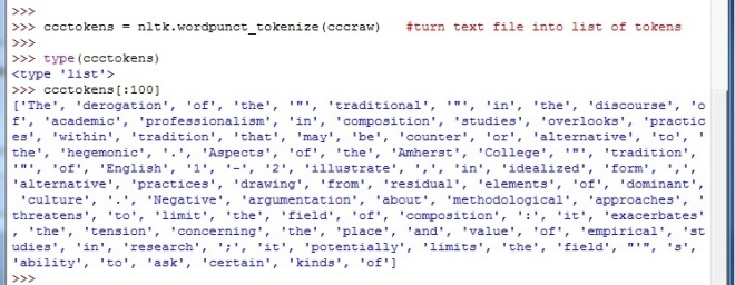
2. The next step involves ‘tokenizing’ the raw text string. Tokenization turns the raw text into tokens: each word, number, symbol, and punctuation mark becomes its own entity in a long list. The line ccctokens[:100] shows the first 100 items in the now-tokenized corpus. Compare this list to the raw string above, listed after cccraw[:150].
Tokenization is an essential step. Running analyses on raw text is not as accurate as running analyses on tokenized text.
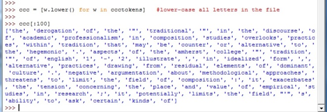
3. Next, all the words in the tokenized corpus need to be converted to lower-case. This step ensures that the NLTK does not count the same word as two different tokens simply due to orthography. Without lower-casing the text, the NLTK will, e.g., count ‘rhetoric’ and ‘Rhetoric’ as different items. Obviously, some research questions would want to take this difference into account, but otherwise, skipping this step might muddy your results.
4. Finally, attach the functionality of the NLTK to your corpus with this line: nltk.Text(tokenname)
‘token name’ would be whatever you’ve named your file in the preceding lines. The definition ID’s used in the examples above (ccc, ccctokens, cccraw) can obviously be changed to whatever you want, but it’s a good idea to keep track of them on paper so that you aren’t constantly scrolling up and down in the IDLE window.
Now the corpus is ready to be analyzed with all the power of the Natural Language Toolkit.
Race, Gender, and Dot Density Maps
Two examples of dot density maps, which are primarily used to visualize demographic space.
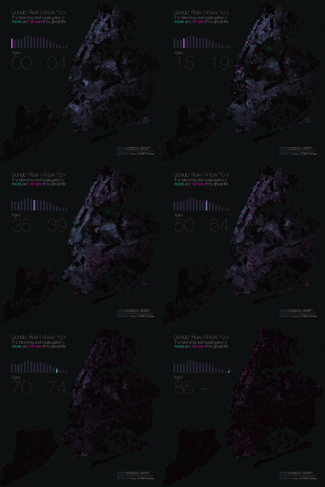
1. At UXBlog: The Dispersion of Life and Gender in New York City
Now it gets interesting. We are in the age-span where teens/young adults can choose where to live. And they choose paths that are not gender-neutral. Immediately we see clusters of females and, to a lesser extent, clusters of males. What’s the deal? College. And prisons.
Also notice the disappearance of NYC males at the outer edge of life: women outnumber men 2-to-1.
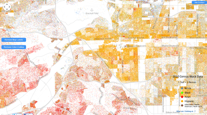
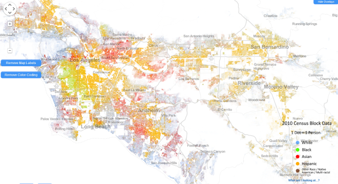
2. The Racial Dot Map is equally interesting. 1 dot = 1 person, coded for reported race or ethnicity. It is the most detailed visualization of U.S. racial data ever compiled. Here’s a screenshot of my Heimat, California’s Inland Empire, the urban and suburban sprawl between Los Angeles and Riverside:
Asians crowd into upper middle class enclaves in the hills. That’s a stereotype in the area: if the town ends in “hills” or “heights,” it’s an Asian town. The stereotype is generally true.
While most of America flushes blue (white), most of the L.A. Southland flushes yellow (Hispanic).
Rich whites crowd along the coasts. Further inland, the black/Hispanic borderland of South Los Angeles is the site of often violent turf warfare between black and Mexican gangs. Both of my parents grew up in South Los Angeles, in Lynwood, between South Gate and Compton. My father attended Compton College; his grandfather owned a gas station in Compton. It would be fascinating to see a diachronic dot density map of this area. The direction and intensity of white flight and black replacement, followed by the direction and intensity of white and black displacement by Hispanics after the 1970s.
Any demographic discussion that does not make reference to these dot density maps is inadequate. They are, in the words of the UXBlog, the most “truthful” maps for visualizing social data. 1 dot = 1 data point.
Of course, the maps, as presented, still have limitations. Big ones. For example, in the racial map above, the ethnic classifications come from U.S. Census data, which deploy the misleading term “Hispanic,” a catch-all word invented in 1970 by D.C. Anglos who didn’t know the difference between Iberians, mestizos, and Amerinds but realized they couldn’t keep calling them all “white.” In reality, some Hispanic dots have predominantly European ancestry and look like John Travolta while others have predominantly Amerind ancestry. Most are mestizo (60% European and 40% Amerind, on average, for Mexicans). Depending on ZIP code, 40-70% of California Hispanics check “white” on the racial portion of the Census form. The map could be improved by turning Hispanic yellow into at least 2 shades—one for mestizos and Iberians, the other for individuals who primarily identify as Amerinds.
However, this limitation is a limitation of data-collection, not a limitation inherent in dot density maps. The maps can handle complications. Can the data collectors?
[ADDED: A step in the right direction.]


